Global Star
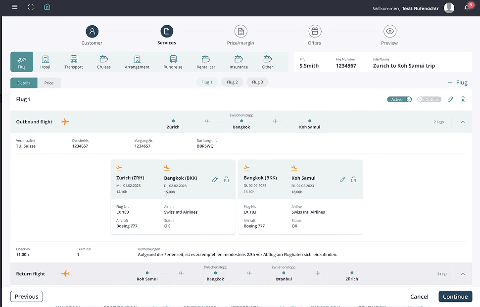
Owned the UX strategy and design system for a high-volume travel agency SaaS. Drove a 30–40% reduction in booking time by rethinking data-heavy workflows and introducing a modular, scalable UI architecture for multi-leg itinerary management.

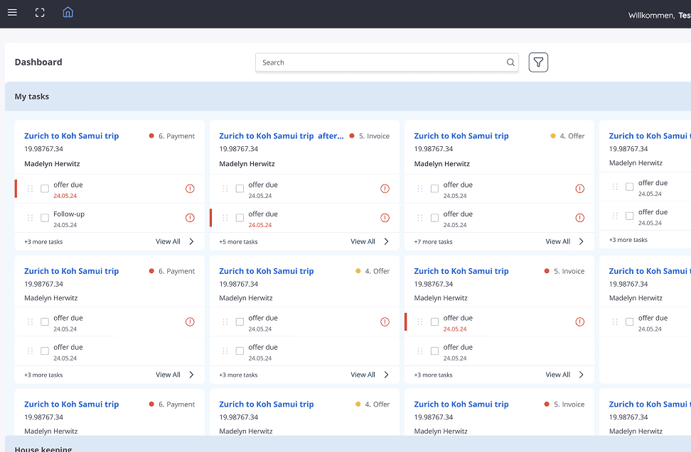
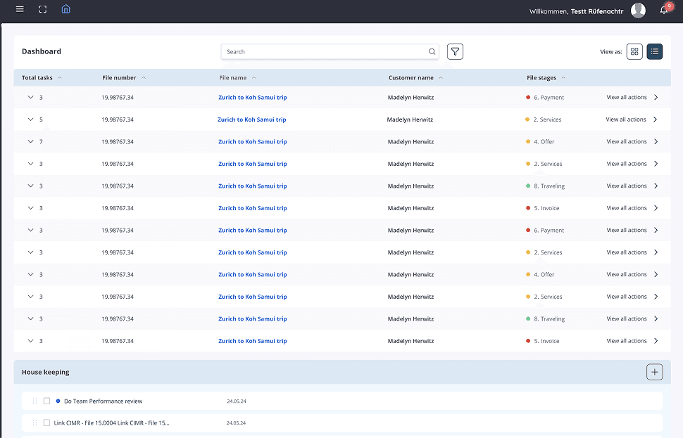
Global Star is an enterprise-level SaaS platform built for travel agencies to manage and streamline complex travel bookings across flights, hotels, transportation, and more. Designed specifically for high-volume booking agents, the platform simplifies data-heavy workflows, enabling agents to efficiently create, edit, and manage multi-leg itineraries in a centralized interface.
🔨 Problem Statement
The platform was built for travel agents who needed to manage multi-leg bookings across services like flights, hotels, and transport.
The challenge was to:
· Display complex data with minimal scrolling
· Avoid excessive clicks
· Provide a user-friendly, compact layout
🎯 Goals
The goal is to streamline booking workflows by simplifying data interactions, clarifying flight details, and reducing visual clutter.
· Enable faster booking workflows
· Simplify interaction with large volumes of data
· Improve clarity of flight routing and booking status
· Reduce visual clutter
🧠 Discovery & Research
Discovery & Research involved interviewing users and stakeholders, identifying friction points, and mapping user journeys in Miro.
· Conducted user interviews with travel agents and stakeholders
· Identified key friction points in navigation, data entry, and flight preview
· Created mind maps and flows in Miro to explore user journeys
Brainstorming with Internal teams:
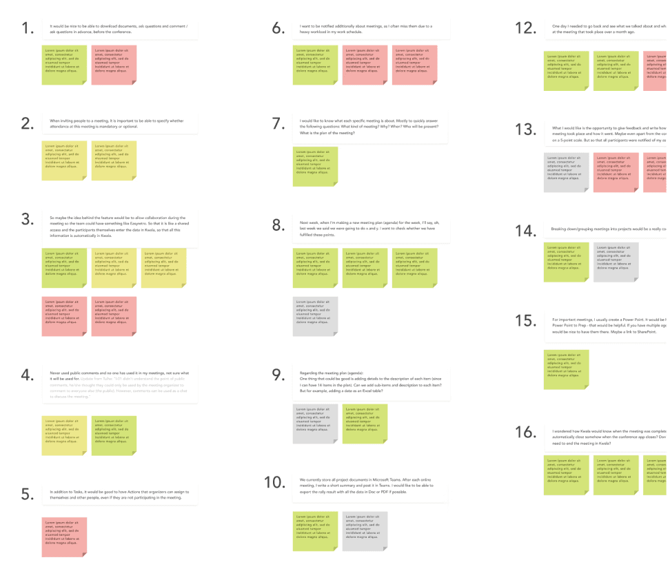
🎯 Key Findings
· Agents felt overwhelmed by long scrolling screens
· Previewing flight details required too many clicks
· Lack of hierarchy made it hard to prioritize tasks
🧱 Wireframing
· Designed low-fidelity wireframes using FigJam
· Introduced drawers, accordions, and sticky menus to reduce clutter
· Prioritized layout that supports quick switching between services (Flights, Hotel, etc.)
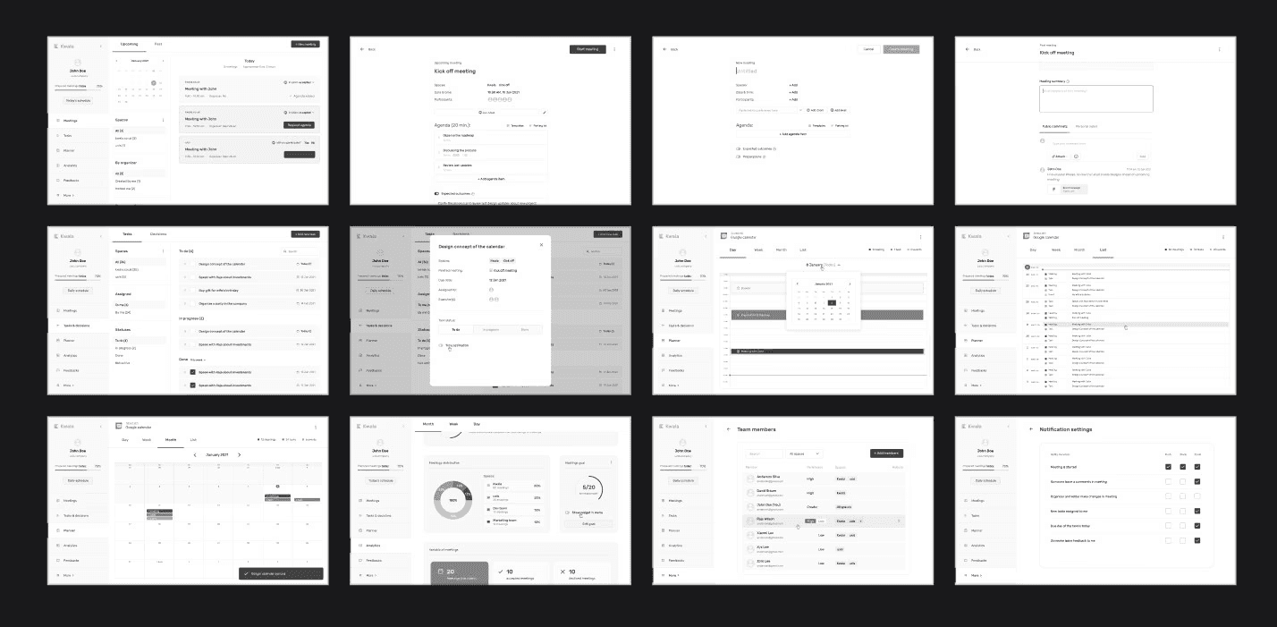
🎨 High-Fidelity Design
· Created high-fidelity UI screens in Figma
· Used a modular, grid-based layout
· Clear typography and iconography for faster scanning
· Step-based navigation (Customer → Services → Pricing → Offers → Preview)
📈 Results
· 30–40% faster booking time based on agent feedback
· Reduced scrolling by introducing tabbed and collapsible views
· Positive reviews from internal teams for ease of use and clarity
· Built a reusable design system for scalability
🏆 Key UX Wins
✅ Compact layout with expand/collapse features
✅ Clear data visualization for multi-leg flights
✅ Hassle-free booking workflow
✅ Action buttons always visible (“Continue”, “Cancel”)
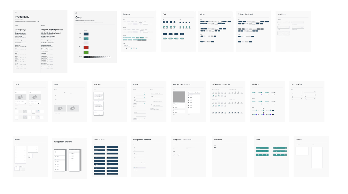
📁 Design System Components